A Q&A with our design partner, Courtney Rowson of Stitch Design Co., and our founder, Aishwarya.
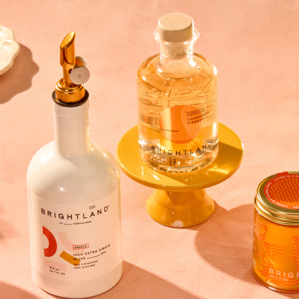
[close type="rte"] [carousel] [open type="rte"]In honor of the debut of Brightland’s vinegars, we sat down with our design partner, Courtney Rowson of Stitch Design Co., and our founder, Aishwarya, to discuss the creation of our vinegar bottles. We worked with Stitch Design Co. on Brightland’s hero products, AWAKE and ALIVE, as well as on our brand’s look and feel for our launch. We teamed up with them again to design our new vinegars! Read below for a Q&A on the thought process that went into creating the beautiful bottles for PARASOL and RAPTURE
What factors were you thinking about when approaching the design of the vinegar bottle?
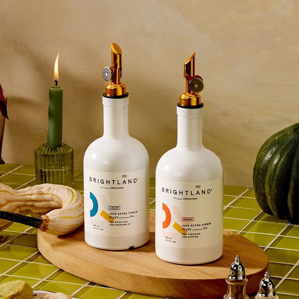
Courtney: Our primary goal was to design a new packaging system that complemented the strength and purity of Brightland’s olive oils, with a design that was bold and captivating to the consumer.
Aishwarya: We wanted our olive oils and the vinegars to thoughtfully sit next to each other, and not look exactly the same, but also not be completely different, and I knew partnering with Courtney and SDCO again would help us get there.
How was developing the bottle for vinegar different than developing the bottle for olive oil?
Courtney: Fortunately, the strong foundation of Brightland's brand informed the palette, design direction and approach. The challenge was to use those assets in a new, compelling way that would be equally as successful as the olive oil. Working closely with Aishwarya, we worked through several concepts until we landed on a solution that carried on the inspiring characteristics of the oils and combined unique texture, color and bold shapes to create a compelling solution.
Aishwarya: It was much harder, in my opinion, to work on this vinegar debut; when we launched the olive oils in 2018, we had a completely blank slate! With vinegars, we had thousands of customers who loved our oil bottles that we needed to keep in mind and think about.
What did you use for inspiration (books, film, magazines, art) for the label and design?
Courtney: Knowing that the solution needed to complement the boldness of the brand, we studied abstract art from the mid-20th century and found inspiration and cues from its simplicity and strong color combinations.
Aishwarya: California dawn and dusk, images of 1970's South of France, florals from Putnam flowers and Bloom & Plume, and 1980's Positano.
[close type="rte"] [open type="images" count="1" small=“true”] [close type="images"]
[open type="rte"]
Why is the vinegar bottle clear but not the olive oil bottle?
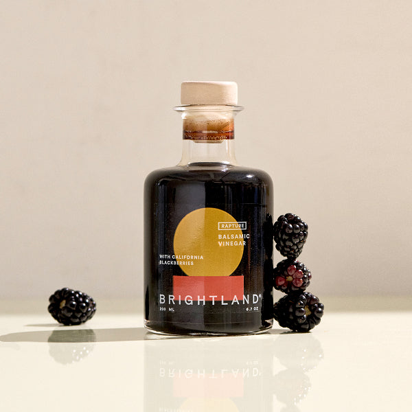
Courtney: During the conceptual phase, we explored several options for the vessel and ultimately felt a clear glass bottle would help define the vinegars as a new category and celebrate Brightland’s commitment to transparency. Knowing that the clear solution might not feel as unique to the consumer, the design solution had to work a little harder. A combination of clear labels and subtle reveals add visual interest and elements of surprise.
Aishwarya: From a functional standpoint, Brightland olive oil bottles are coated with organic UV coating to protect the oil from light, which is a major enemy to all olive oil. It also happens to look lovely! Light is not something that affects the quality of vinegar, so it was exciting to have some room to be able to use a clear bottle.
How long did the design process take?
Courtney: From the conceptual phase, where we shared several design directions and packaging solutions with Aishwarya, to the prototyping and testing, the process took about three months.
What is your favorite part of the vinegar bottle?
Courtney: That’s a tough question. We really love the strength of the color palette and the subtle message that's revealed once you work your way through the bottle!
Aishwarya: I love the names (PARASOL & RAPTURE) and I adore the back of the labels for their lovely color palette.
[close type="rte"] [open type="images" count="1"] [close type="images"]

